Creating a beautiful logo is not the same thing as creating an effective brand identity.
A strong brand identity has to do much more than look impressive in a portfolio.
It needs to represent the personality of the company.
It needs to appeal to the right customers.
It needs to differentiate the business from competitors.
It needs to work at different sizes and across different applications.
And ideally, it should continue working for years rather than looking outdated six months after launch.
That is why brand identity design can be one of the most powerful services a graphic designer offers, but also one of the easiest to approach incorrectly.
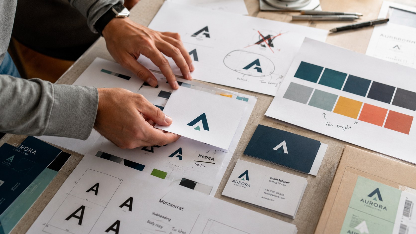
When you create an identity for a client, the outcome affects more than your own portfolio. The client will use that work on websites, packaging, marketing materials, social media, signage, products, presentations, advertising, and possibly dozens of other touchpoints.
If the identity succeeds, your client may gain recognition, credibility, stronger customer connections, and a more professional presence.
If it fails, that reflects on your work too.
A successful identity can become an excellent case study, generate referrals, and lead to testimonials and future clients.
So instead of rushing through the project and concentrating only on aesthetics, it is worth understanding some of the biggest brand identity design mistakes and how to avoid them.
Mistake #1: Designing Around Trends Instead of the Brand
Graphic design trends can be incredibly tempting.
You see a particular typeface everywhere.
A color combination suddenly becomes popular.
Everyone starts using chrome effects, neon colors, gradients, retro typography, or a particular illustration style.
Then a client says:
"I want something like that."
The problem is that trends have expiration dates.
There is nothing wrong with being aware of current design trends or using them when they genuinely support the brand. Certain businesses may even need to feel especially current or culturally relevant.
But a brand identity should not exist simply because something looks fashionable right now.
Ideally, you should think in terms of years.
Could this identity still work in 10 years?
Could it work in 20?
That does not mean brands never evolve. Many of the world's most recognizable companies refine their identities over time.
But refinement is different from completely rebuilding a visual identity every few years because the previous one followed a short-lived trend.
Burberry is a good example of a brand with recognizable visual elements that have survived enormous changes in fashion and culture.
The identity has evolved, but familiar components, such as its classic check pattern and overall visual heritage, remain recognizable.
The lesson is simple:
Build around the personality and positioning of the brand first. Use trends only when they genuinely support it.
Mistake #2: Ignoring the Target Audience
One of the most common branding mistakes happens when the design is created for the client rather than for the client's customer.
Of course your client needs to approve the work.
But the client is not always the target audience.
This can be difficult because business owners naturally have personal preferences.
They may love purple.
They may hate serif typography.
They may want something playful.
But the important question is:
Will those choices connect with the people they are trying to attract?
Imagine you are designing a luxury skincare brand intended for established, higher-income customers looking for premium products.
If the brand identity uses highly cartoonish graphics, juvenile typography, and bright playful colors, the result may unintentionally communicate something closer to skincare for young teenagers.
The design could look great.
It could be technically well executed.
But it would still be strategically wrong.
That is why research is such an important part of the brand identity design process.
Before designing, understand:
- Who is buying?
- How old are they?
- What do they value?
- What alternatives are they considering?
- What visual language will feel familiar?
- What would make the brand feel credible?
- What might immediately turn them away?
Good brand identity design is not created in a vacuum.
It communicates with a specific person.
Mistake #3: Overcomplicating the Logo
One of the classic logo design mistakes is trying to prove your design skills by putting too much into the logo.
Too many shapes.
Too many colors.
Too much shading.
Too much illustration.
Too much detail.
Too many ideas competing for attention.
New designers can be especially vulnerable to this because simplicity sometimes feels too easy.
You might think:
"If this logo is simple, will the client think I didn't do enough?"
But creating something simple, distinctive, memorable, and appropriate is often much more difficult than making something complicated.
Consider the Nike Swoosh.
It works on a billboard.
It works on a shoe.
It works on a hat.
It works on a small label.
You recognize it instantly.
That is incredibly powerful.
Your client's logo does not need to imitate Nike, but the principle applies:
Can someone recognize it quickly?
Can it work small?
Can it work without color?
Can someone remember the basic shape?
If the answer is no, simplify.
Professional logo design is not about demonstrating every technique you know.
It is about creating the strongest solution with the least unnecessary complexity.
Mistake #4: Ignoring the Brand's Personality
A company is not simply an industry.
Two pizza restaurants can have completely different personalities.
One might be a colorful family restaurant built around birthday parties and children.
Another might be an intimate pizza and wine bar designed for date nights and young professionals.
They both sell pizza.
But their brand identities should look completely different.
If you begin designing before understanding the brand's personality, you are essentially working blind.
Before creating visual concepts, ask questions such as:
- Is the brand serious or playful?
- Premium or accessible?
- Traditional or modern?
- Bold or understated?
- Energetic or calming?
- Rebellious or dependable?
- Sophisticated or casual?
- Youthful or established?
These characteristics should influence every part of the identity.
Typography.
Color.
Photography.
Illustration.
Composition.
Logo style.
Even spacing and visual rhythm.
Think of brand personality almost like designing for a person.
You would not choose the same clothes for every personality.
You should not choose the same visual language for every brand either.
Mistake #5: Making Poor Color Choices
Color is one of the fastest ways to communicate personality.
It is also one of the easiest ways to create a disconnect.
A common mistake is selecting colors because they simply look attractive together without considering what they communicate.
Imagine a conservative financial services company using neon pink and fluorescent green as its dominant brand colors.
Could someone theoretically create a successful financial brand using those colors?
Absolutely.
There are always exceptions.
But there would need to be a very clear strategic reason.
Otherwise, those colors may work against qualities the company needs to communicate, such as reliability, stability, professionalism, and trust.
Compare that with Fidelity Investments, which has long used green prominently within its identity.
Green can connect naturally with ideas such as growth, prosperity, and money.
The color choice makes sense within the context of the business.
This does not mean every financial company needs to be green or blue.
The point is to make color decisions intentionally.
When creating a brand color palette, consider:
- Brand personality
- Target audience
- Industry expectations
- Competitor colors
- Emotional associations
- Accessibility
- Print and digital reproduction
And in most cases, avoid creating an unnecessarily large palette.
A few intentional colors are usually much easier for a client to use consistently.
Mistake #6: Using Inconsistent Typography
Typography is one of the strongest tools available to a brand identity designer.
It is also one of the quickest ways to make a brand look amateur.
Too many typefaces create visual noise.
Poorly paired fonts create inconsistency.
Typography that conflicts with the brand personality can undermine the entire identity.
Try to establish a clear typographic system.
Usually, one or two primary typefaces are enough.
If you pair two typefaces, make sure there is a meaningful contrast between them.
If you use different weights from the same family, avoid choosing weights that are so similar that the difference looks accidental.
For example, a bold weight paired with regular or light will generally create more useful contrast than bold paired with semibold.
But your responsibility does not end with selecting the fonts.
Explain how the client should use them.
A good brand guide might define:
- headline typeface
- body copy
- subheadings
- web typography
- print typography
- weight hierarchy
- basic sizing relationships
Because if you do not establish the system, the client may create one themselves.
And that can quickly destroy the consistency you worked so hard to build.
Mistake #7: Failing to Research Competitors
Before you start creating mood boards, logo sketches, or visual directions, look at the competitive landscape.
You do not need to perform an enormous brand strategy project every time you create a visual identity.
But you do need to know what already exists.
Otherwise, you could accidentally create something extremely similar to a major competitor.
Or you might produce an identity that simply disappears into the category.
Imagine looking at several major telecommunications brands.
Historically, Verizon has been strongly associated with red.
T-Mobile built tremendous recognition around magenta.
AT&T uses blue.
Sprint became strongly associated with yellow.
Each company established a visibly different territory.
Now imagine if all four companies had used nearly identical blue identities.
Differentiation would become much harder.
When researching competitors, look at:
- logos
- colors
- typography
- photography
- packaging
- websites
- symbols
- visual styles
Then ask:
Where is the opportunity to be different?
You do not need to be different merely for the sake of being different.
But your client should not accidentally blend into a sea of nearly identical brands.
Mistake #8: Forgetting About Logo Scalability
A logo does not live only inside the beautiful presentation you show the client.
Eventually it has to enter the real world.
It may appear:
on a website header.
on an Instagram profile.
on packaging.
on a business card.
on signage.
inside an app.
on merchandise.
on a tiny product label.
on a huge billboard.
A logo that only works when displayed large is not a flexible logo.
That is why scalability should be tested throughout the design process.
Shrink it.
Can you still recognize it?
Turn it into one color.
Does it still work?
Place it on a dark background.
Place it on a light background.
Try a mockup.
Try the smallest realistic application.
If the logo falls apart, something needs to change.
This is another reason simplicity is usually your friend.
You can also create responsive variations when appropriate, such as:
- full logo
- stacked logo
- horizontal logo
- simplified mark
- icon
- one-color version
A strong identity gives the client enough flexibility to remain recognizable in different environments.
Mistake #9: Forgetting the Emotional Connection
This is perhaps the most important mistake because it goes beyond technical design.
People do not experience brands only intellectually.
They experience them emotionally.
A brand might need to evoke:
trust.
excitement.
nostalgia.
confidence.
comfort.
adventure.
luxury.
belonging.
playfulness.
security.
When those emotions support the brand's goals, visual identity becomes much more powerful.
I once worked on an identity for a company creating travel products for children.
The client initially had ideas around particular red and blue colors.
But instead of beginning with those colors, I thought about the deeper emotional relationship people have with travel.
Families create memories.
Adults often remember childhood trips with nostalgia.
Parents want to give their children memorable experiences.
That led to exploring a more nostalgic, vintage travel direction with elements that could connect to old maps and the feeling of memorable journeys.
Suddenly the identity was not simply about a travel product.
It was about the emotional experience surrounding travel.
That is a much stronger foundation.
The Best Brand Identity Decisions Work Together
One important thing to remember is that none of these elements exist independently.
Your target audience affects your brand personality.
Your personality affects typography.
Typography interacts with the logo.
The competitive environment influences your color choices.
Color contributes to emotional perception.
Scalability influences how complicated the logo can become.
Everything connects.
That is why professional brand identity design requires more than making attractive individual elements.
You are creating a system.
A strong visual identity should feel as though all of its components belong to the same world.
How to Impress Your Brand Identity Clients
Clients are impressed by beautiful design.
But they are often even more impressed when you can explain the reasoning behind it.
Instead of saying:
"I chose this green because it looks nice,"
you can explain how the color relates to the brand personality, audience expectations, competitive landscape, and emotional goals.
Instead of saying:
"I made the logo simple,"
you can explain how simplicity improves recognition and allows the identity to remain effective across small digital applications and large-scale print uses.
That shifts you from someone who decorates to someone who solves problems.
And that is a much stronger position for a professional designer.
A Final Brand Identity Design Checklist
Before handing a brand identity over to your client, ask yourself:
Does this rely too heavily on a temporary trend?
Does it appeal to the target audience?
Is the logo simple enough to remember?
Does the visual identity reflect the brand personality?
Are the colors intentional?
Is the typography consistent?
Does the brand differentiate itself from competitors?
Will the logo work at very small sizes?
Does it work in one color?
Does the identity create the right emotional response?
Can the client realistically use this system consistently?
If you can confidently answer those questions, you are much closer to delivering an identity that works beyond the presentation deck.
Because ultimately, that is what matters.
Your job as a brand identity designer is not simply to create something that makes the client say:
"Wow, that looks amazing."
Your job is to create something that still serves their business after the excitement of the presentation is over.
Something recognizable.
Something strategic.
Something flexible.
Something their audience connects with.
And something they can confidently continue building on for years.
That is the difference between making a logo and building a brand identity.